The Best Paint Colors For An Enduring Look In Your Home
Trends come and go. If you paint your walls the "provocative and thoughtful purple shade" of Ultra Violet, as Pantone, itself, calls it, you're probably gearing up to repaint them in whatever the color authority deems the "it" shade next year. If you'd rather pick a paint chip or two and keep your space the same for the long haul, you'll love these colors that endure.
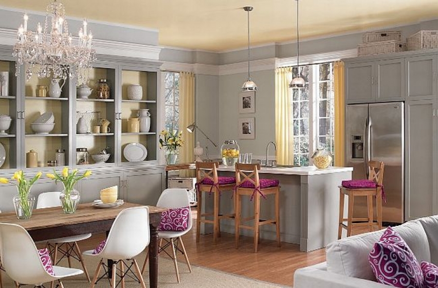
Garden Stone, Clark+Kensington
When it comes to gray, we might be at the end of the widespread trend. But certain shades of gray are classics and "go-to's" for designers - and they'll be around long after the next trend is here and gone.
"I try to stay away from colors with heavy blue undertones, and I direct my clients toward warm grays that will stand the test of time," Ace design expert Katie Reynolds, who prefers Garden Stone, said in Good Housekeeping. "This shade is a favorite."
Revere Pewter, Benjamin Moore
Google Revere Pewter and you will be inundated with countless photos and praise for this iconic shade. Despite its great popularity, you don't have to worry that your home will look cookie cutter because the shade looks different in every home - in every room, even - depending on the angles and the amount of light in the space. It also complements any style of architecture.
 derektime.com
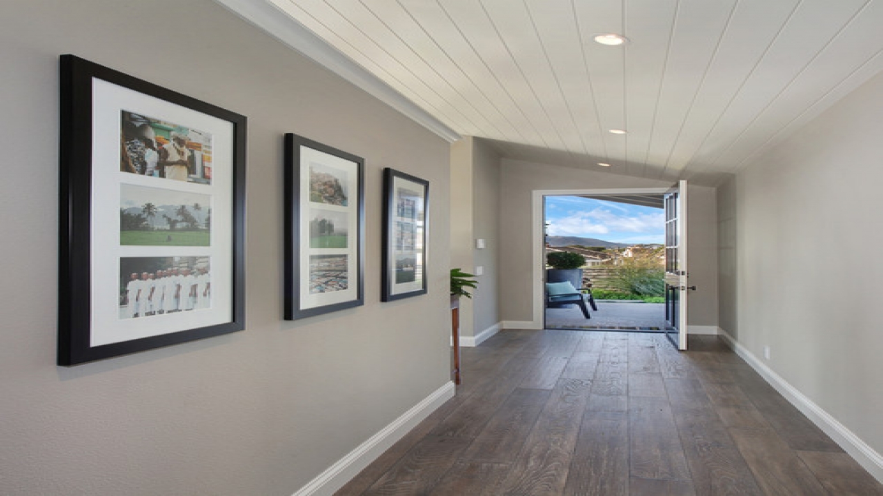
Repose Gray, Sherwin Williams
Greige is not too gray, not too beige. This favorite color toes the neutral line, and not only is it a favorite of designers, it apparently clicks with homebuyers, too. Pick a mix of gray and beige - "greige" - for your exterior," said MyDomaine. A recent analysis of colors that help build value "found homes with these shades on their outside sold for $1,526 more than white properties."
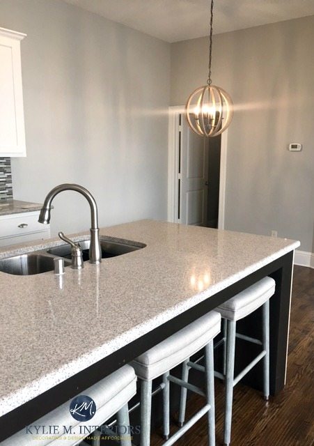
Repose Gray is appreciated because it is "the perfect paint color for almost any room whether you're living in your home or preparing it for sale," said Kylie M. Interiors. "Repose Gray is a soft, light gray that has soft and SUPER subtle undertones of brown with a wee dab of purple -- not enough brown to qualify it as a greige, it's just the undertone that adds a certain softness to this lovely color, keeping it from falling flat."
 kylieminteriors.ca
Manchester Tan, Benjamin Moore
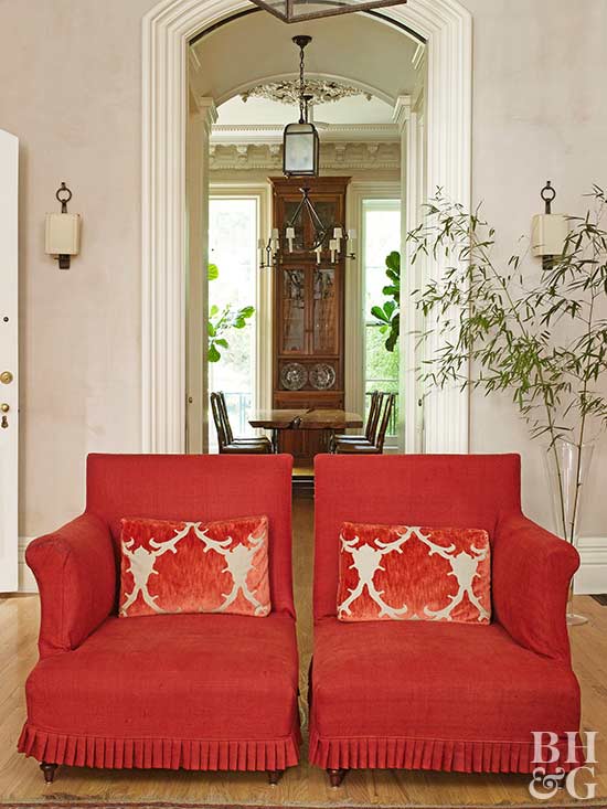
Described as a warm neutral, this hue drinks in the sun but also changes slightly depending on the amount of light and shade in the room, adding interest you don't always find in a paint color from the beige family.
 bhg.com
Clay Beige, Benjamin Moore
"This is my go-to whenever a neutral, but not boring, background is needed," said Atlanta designer Mandy Lowry in Better Homes and Gardens. "It's a chameleon color. It has the amazing ability to read either warm or cool and never fails to make its surroundings elegant in any light."
Super White, Benjamin Moore
 stylebyemilyhenderson.com
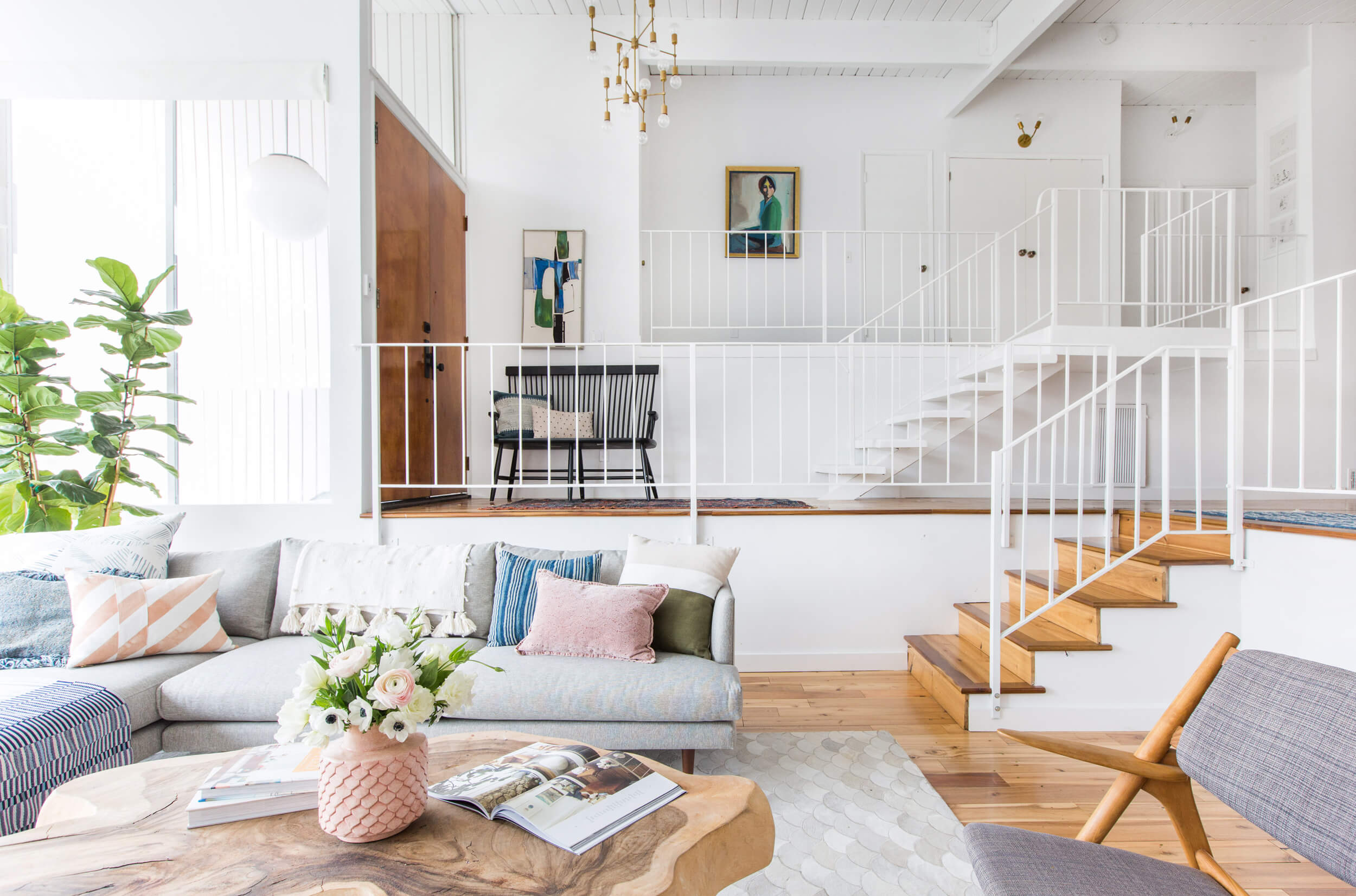
You would think it would be easy to pick a shade of white, but…no. Really, there is nothing more challenging when it comes to choosing paint. This one has a little too much yellow. This one is slightly beige. Wait, is that baby blue? I thought I bought white! Ugh.
Go to the paint store, buy a gallon of Super white, and you'll never look for another shade of white again. "Our go-to white around here if you are looking for a modern clean color," said Emily Henderson. "It reflects light in such a pretty way and doesn't have any cool tones that would it go blue or warm tones that would make it yellow."
 pinterest.com
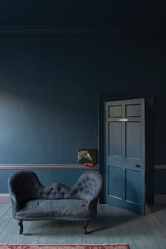
Stiffkey Blue, Farrow & Ball
This moody blue brings some drama to a living space without creating a cave-like feel, and is also a good choice for the kitchen, according to Brian Paquette of Brian Paquette Interiors.
"For cabinets, I am more drawn to the material and detail of the actual cabinet and aim to keep the paint neutral, bright, and reflective of what may be going on in nearby room" he said on MyDomaine. "My go-to's for paint colors are Decorators White by Benjamin Moore and Shaded White by Farrow & Ball for that European look. A contrast on an island or lower cabinets can be fun, and once again I lean toward a fun color that may run throughout the space, a deep gray, like Down Pipe from Farrow & Ball, or a blue that reminds me of the deepest depths of the ocean, like Stiffkey Blue from Farrow & Ball."
Want to estimate your home improvement costs before talking with a contractor? Claim your home for free with bluehammer to estimate costs, secure your home inventory and learn more about your home.
* THIS REPORT IS AN OPINION THAT MAY BE INACCURATE AND IS PROVIDED SOLELY AS AN INFORMATIONAL TOOL NOT DESIGNED TO PROVIDE DEFINITIVE ANSWERS. ALL ELEMENTS ARE OFFERED "AS IS" AND BLUEBOOK EXPRESSLY DISCLAIM ANY AND ALL WARRANTIES, REPRESENTATIONS, AND GUARANTEES OF ANY NATURE, EXPRESS, IMPLIED OR OTHERWISE, INCLUDING BUT NOT LIMITED TO ANY IMPLIED WARRANTIES OF MERCHANTABLITILY, NONINFRINGEMENT, TITLE, QUIET ENJOYMENT, ACCURACY, OR FITNESS FOR A PARTICULAR PURPOSE. IN NO EVENT SHALL BLUEBOOK (OR THEIR SUPPLIERS) BE LIABLE FOR ANY GENERAL, DIRECT, SPECIAL, INCIDENTAL, INDIRECT OR CONSEQUENTIAL DAMAGES OF ANY KIND, OR ANY DAMAGES WHATSOEVER (INCLUDING WITHOUT LIMITATION, THOSE RESULTING FROM USE OF THE PRODUCT, INCLUDING : (1) RELIANCE ON THE MATERIALS PRESENTED, (2) COSTS OF REPLACEMENT GOODS, (3) LOSS OF USE, DATA OR PROFITS, (4) DELAYS OR BUSINESS INTERRUPTIONS, (5) AND ANY THEORY OF LIABILITY, ARISING OUT OF OR IN CONNECTION WITH THE USE OR PERFORMANCE OF INFORMATION) WHETHER OR NOT BLUEBOOK HAS BEEN ADVISED OF THE POSSIBILITY OF SUCH DAMAGES.